©
Date
Jul 2021
Client
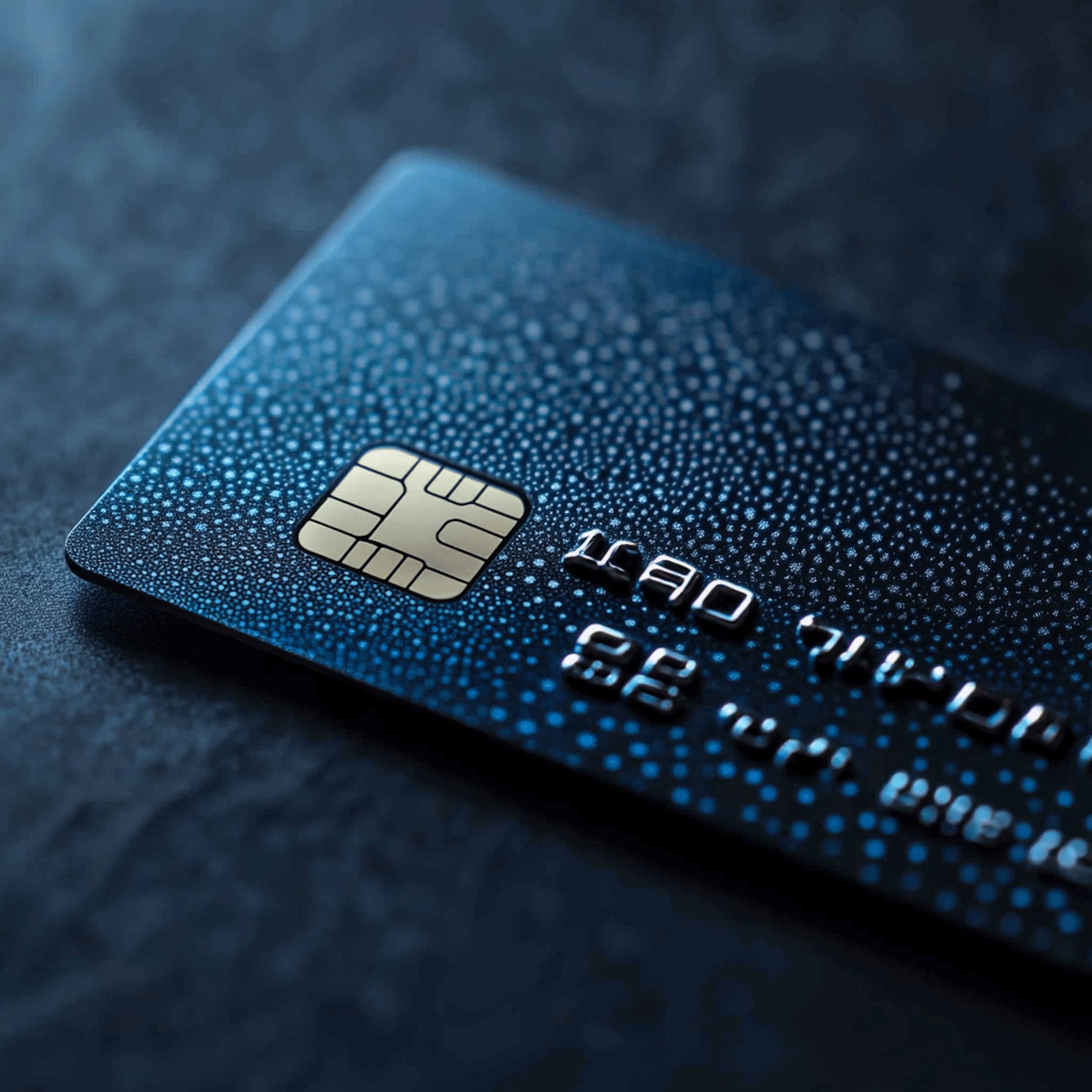
Lightspeed
Industry
FinTech / Payments
Timeline
8 Months
Logo design
The Challenge
After ten years of steady growth, Lightspeed's brand was showing its age in a rapidly evolving payments landscape. They needed a brand refresh that signaled innovation while maintaining the trust they'd earned over a decade.
Lightspeed faced the classic established company dilemma: how to feel fresh and forward-thinking without alienating existing customers who chose them for stability. The payments industry was being disrupted by fintech startups with bold brands, but Lightspeed couldn't afford to look experimental. They needed evolution, not revolution.
Product onboarding flow

The Solution
Rather than a complete overhaul, we orchestrated a strategic evolution that honored their equity while injecting fresh energy. The refined identity system adapts seamlessly from payment terminals to billboard campaigns.
We developed a brand refresh that customers barely notice—they just feel better. The updated visual system maintains familiar equity while introducing contemporary elements that signal innovation and growth. Every design decision balanced heritage with progression, proving that sometimes the best rebrands strengthen what's already working rather than starting from scratch.

Sales materials


Brand guidelines

Brand guidelines

The Process
Logo evolution, brand guidelines update, marketing website, product onboarding flow, and sales materials delivered over 8 weeks.
Through brand equity research and stakeholder alignment, we identified which elements to preserve and which to evolve. The streamlined process focused on high-impact touchpoints that would immediately signal the brand's evolution while maintaining operational continuity. The result refreshes Lightspeed's presence without disrupting their market position or customer relationships.
By the numbers

Latest projects
